Web Design
High-Converting Web Design: From Brief to Launch
A conversion-focused web-design process grounded in user decisions, useful content and production performance.

The short answer
High-converting web design makes the next useful decision easy for the right visitor. Define one primary audience and action, answer their most important questions in a clear order, support claims with verifiable proof, and remove interaction uncertainty. Responsive behavior, accessibility and fast loading are part of the conversion experience. Measure qualified outcomes after launch rather than judging success from visual novelty alone.
Key takeaways
- Design around one audience, decision and qualified outcome.
- Use clear message hierarchy and verifiable proof.
- Treat responsive accessibility and performance as conversion requirements.
- Improve from trustworthy post-launch evidence.
Define the audience and conversion goal
Name the visitor, their situation and the decision they are trying to make. A page aimed at an informed buyer needs different depth and proof from one introducing a new category. Select one primary action and useful secondary routes for people who are not ready.
Establish what qualifies as a valuable outcome. A large volume of low-fit form submissions can create more work without helping the business. Align the page, form and measurement with the customer relationship the organization can actually support.
- Primary audience and entry context
- Question or concern blocking the next step
- Primary and secondary actions
- Definition of a qualified outcome
Build message and information hierarchy
Lead with a specific value proposition the intended visitor can understand, then provide the mechanism, proof, fit and next step. Headings should help a scanning reader reconstruct the argument. Remove internal terminology unless the audience uses and values it.
Write or outline content before final layout. Design can clarify meaning, but it cannot compensate for missing positioning or unsupported claims. Keep important conditions close to the action they affect.
Use proof responsibly within the page structure
Match proof to the claim: show relevant work, process evidence, product detail, documented outcomes or named credentials the organization can substantiate. Do not invent testimonials, clients, awards or performance figures. If evidence is not available, make the explanation and scope more precise rather than manufacturing authority.
Place proof where doubt appears instead of confining it to a decorative carousel. Case work should explain the problem and contribution, while process content should reduce uncertainty about what happens after contact.
Design responsive states and accessible interactions
Design for content behavior across narrow and wide spaces, not a single desktop canvas. Navigation, comparison, forms and media need intentional reflow. Test long headings, translated text, validation errors and touch targets at small widths.
Use semantic structure, readable contrast, visible focus and clear labels. Motion should respect user preferences and never block the task. An interface people cannot operate is not a high-converting interface.
- Useful hierarchy at 320-pixel and larger viewports
- Keyboard and screen-reader operable navigation
- Form labels, instructions and recoverable errors
- Optimized images with descriptive alternatives
Protect performance and measure after launch
Set budgets for media, fonts and scripts, then test production-like pages on mobile networks. Load the primary content without waiting for nonessential effects. Validate metadata, canonical URLs, structured content and analytics before release.
Review qualified actions, journey drop-off, form errors, search queries and user feedback. Form a hypothesis before changing a page and keep a record of releases. Optimization means learning from behavior, not continuously rearranging visual elements.
From our verified catalogue
Related Dragside services
Frequently asked questions
- What makes a website convert?
- A strong fit between visitor intent, clear value, credible proof, low interaction uncertainty and a useful next step. Performance, accessibility and reliable forms support that path. No visual pattern guarantees conversion without the right offer and audience.
- Should web design or copy come first?
- Positioning, audience questions and a content outline should lead. Copy and interface design can then develop together because hierarchy, media and interaction affect how the message works. Finalizing decoration before meaning usually creates avoidable rework.
- What should a web-design handoff include?
- Include responsive layouts, component and state behavior, content, assets, accessibility intent, interaction notes and acceptance criteria. Designers should review the working build because implementation, browser behavior and real content reveal issues static files cannot.
Related guides
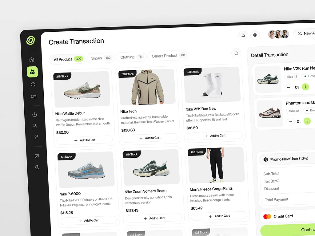
Ecommerce Website Development That Converts
Build a commerce experience around customer decisions instead of treating the storefront as a collection of templates.
Read guide
Email Copywriting and Automation: Build the Funnel
Connect words, audience context and automation logic so every email has a clear role in the customer journey.
Read guide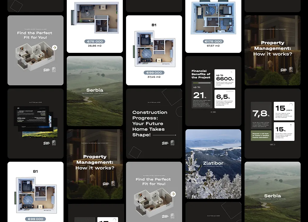
Brand Identity, Packaging and Merch: One System
Build one recognizable brand system that works from a product screen to a physical package.
Read guideFrom idea to delivery